
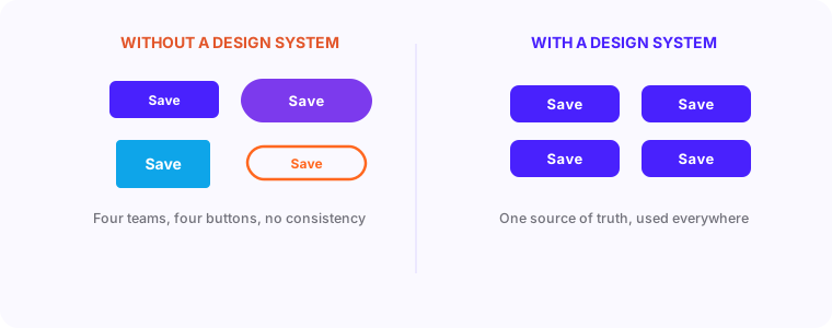
When your team is one designer and one developer, consistency happens naturally. When you hit three designers, four developers, and multiple projects running in parallel, things start diverging. Buttons have three different border radiuses. Colors are slightly off between pages. Spacing is inconsistent. The product starts looking like it was built by different companies.
“A design system is not extra work - it is the thing that stops every new screen from becoming extra work.”
Why teams adopt design systemsWhat a Design System Actually Is
It's not a Figma file with pretty components. A design system is a shared language between design and development. It consists of documented design tokens (color values, spacing increments, typography scales, border radius values, shadow definitions), reusable UI components with clearly defined states and variants, and written guidelines for when to use which component in which context.
The system exists in two places simultaneously: in Figma as the source of truth for designers, and in code as the component library that developers use. When they're in sync, a designer can hand off a screen and a developer can build it exactly without guessing. When they drift out of sync, both slow down.
The Component Inventory Process
Before building a design system, take stock of what you already have. A component inventory involves screenshotting every distinct UI element across your product and grouping similar ones together. Most teams discover they have 4 or 5 variations of button styles, 3 different card patterns, and 2 incompatible navigation bars that accumulated through different sprints.
The inventory reveals the full scope of what needs standardizing. It also highlights which components are used most frequently - those are the ones to standardize first. A button component that appears on 80% of screens delivers far more value than a specialized chart component that appears on 2 screens.
- Screenshot every unique UI element across all your product screens
- Group similar elements together and identify how many variants exist
- Rank components by frequency of use across screens
- Identify which variants can be consolidated without losing necessary functionality
- Note which components have the most inconsistency between design and development
Token Naming Conventions That Work
Token naming is where many design systems go wrong. Naming a color '#6b4eff' as 'purple' works until you rebrand. Naming it 'primary-action' works forever because it describes purpose rather than appearance. When you change the primary color from purple to blue, you update one token value and it propagates everywhere.
Use a two-tier token structure. Primitive tokens define the raw values: color-purple-500, spacing-4, font-size-base. Semantic tokens reference primitives and define purpose: color-action-primary references color-purple-500, spacing-component-padding references spacing-4. Components use semantic tokens. This means rebranding requires changing semantic token references, not updating every component.
- color-brand-primary, color-brand-secondary (not 'purple', 'blue')
- color-text-primary, color-text-secondary, color-text-disabled
- color-feedback-success, color-feedback-warning, color-feedback-error
- spacing-xs, spacing-sm, spacing-md, spacing-lg, spacing-xl
- border-radius-sm, border-radius-md, border-radius-full
Documentation Tools and Adoption Strategy
Storybook is the industry standard for component documentation. It lets you view every component in isolation, with all its states and variants, with code examples alongside the rendered output. Developers can browse available components before building new ones. Designers can verify implementations match their intent.
Adoption is a bigger challenge than building the system. Teams resist using a design system when it's incomplete, when it's hard to find what you need, or when using the system takes longer than building from scratch. Launch with a small, complete set of components rather than a large, incomplete one. A system with 15 well-documented, thoroughly tested components is more valuable than 60 half-finished ones.
Measuring Success and Handling Resistance
Measure design system adoption by tracking what percentage of UI in new features uses system components versus custom-built components. Measure design-to-development consistency by reviewing builds against designs before launch - track how many design decisions required re-implementation. Track sprint velocity for features that use the system versus features that don't.
The most common resistance comes from designers who feel the system limits creativity and developers who think custom-built is faster for one-off needs. Address the first by being clear about what's flexible and what's fixed - the system governs structural patterns, not visual creativity. Address the second by making the system genuinely easy to use and showing velocity data from teams that have adopted it.
The goal isn't perfection. It's consistency. Consistency ships faster because designers stop re-solving solved problems and developers stop re-building built components. A 20% reduction in UI build time compounds across every sprint for the life of the product.