
“A visitor decides whether to trust your site in the time it takes to blink. Slow or generic, and they are gone before they read a word.”
The product-first trap, in one lineThe Product-First Trap
Most founders pour months into building their product and treat the website as an afterthought. The assumption is that a great product sells itself. It doesn't. Your website is where first impressions happen, and if it looks generic or confusing, visitors bounce before they ever see your demo.
We've audited dozens of early-stage startup websites and the pattern is almost always the same. The team spent 90% of its energy on the product, then handed the website to a developer on the last week before launch. The result is a site that technically exists but does nothing to convert curiosity into contact.
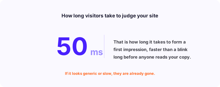
The cost of that mismatch is real. Studies consistently show that users form an impression of a website within 50 milliseconds. If that impression says 'unpolished' or 'confusing,' they leave. You never get a second chance to make that first impression, and no amount of paid traffic fixes a broken funnel.
Common Mistakes Founders Make With Website Copy
The most damaging mistake isn't visual - it's the copy. Most startup homepages lead with what the product is, not what problem it solves. 'AI-powered workflow automation platform' tells a visitor nothing about whether it's relevant to them. 'Stop spending 3 hours a day on reports' lands immediately.
Jargon is the second killer. Founders are deep in their product and use internal language that means nothing to a first-time visitor. Every sentence on your homepage should pass the so-what test. If a visitor can read a sentence and reasonably ask 'so what?' - rewrite it.
- Value proposition buried below the fold instead of leading with it
- Copy written for the team, not the target customer
- No specific outcome stated - only features described
- Social proof missing or placed too far down the page
- Call-to-action text is vague ('Learn more' instead of 'See how it works')
- Mobile experience treated as an afterthought after desktop is finished
Why Mobile-First Is Not Optional Anymore
More than 60% of web traffic now comes from mobile devices. For B2C startups, that number is often higher. Yet most startup websites are still designed on a 1440px desktop screen and then 'made responsive' at the end. That approach produces a technically responsive site that feels frustrating on a phone.
Mobile-first means you design for the smallest screen first and then scale up. It forces prioritization. On a 375px screen you can't fit three columns of text, a sidebar, and a navigation bar. You have to decide what matters most. That clarity almost always improves the desktop version too.
Page speed is tied directly to mobile experience. Google's Core Web Vitals data shows that pages loading in under 2 seconds have bounce rates 30% lower than pages loading in 5 seconds. Compress your images, reduce JavaScript payload, and test on real devices - not just browser dev tools.
How Landing Pages Differ From Product Pages
A common structural error is treating the homepage like a product overview. Product pages describe features in detail. Landing pages convert intent into action. They are not the same thing and they should not look the same.
A landing page has one job: move the visitor to a single next step. Everything on the page should support that one action. Navigation menus, related content links, and footer distractions all reduce conversion rates because they give visitors alternative exits. Dedicated landing pages for paid campaigns routinely outperform homepages by 3x to 5x because they remove those distractions.
Your homepage sits somewhere in between. It needs to address multiple audience types and direct them to the right places. But it still needs a primary call-to-action that the majority of visitors should take. Define that action first, then build the page around it.
When to Rebuild vs. When to Iterate
Not every underperforming website needs to be rebuilt from scratch. The decision should be based on data, not frustration. If your analytics show that visitors are landing, reading, and then not converting, you have a persuasion problem. Iterate the copy, restructure the hierarchy, and A/B test your call-to-action.
If your analytics show that visitors are landing and immediately leaving (high bounce rate, low time on page), you have a relevance or speed problem. The page is not matching what they expected when they clicked. That often requires more significant structural work.
A full rebuild is warranted when: your brand has evolved significantly, your tech stack is holding back performance, or the site structure is so tangled that iterating one thing breaks three others. In those cases, starting fresh is faster than patching.
What a Good Startup Website Looks Like
The best startup websites we've built share a consistent structure. The hero section answers three questions in under 5 seconds: what is this, who is it for, and what should I do next. That's it. No company history, no feature list, no founding story.
Below the hero, there's social proof - real logos, real names, or real numbers. Not 'trusted by companies worldwide' but 'used by 400+ operations teams at logistics companies.' Specificity is credibility.
- Hero section: clear outcome statement plus one primary CTA
- Social proof: logos or specific testimonials within the first scroll
- Problem section: describe the pain in the customer's own language
- Solution section: show how you solve it, not just what you built
- One clear conversion path: demo, free trial, or consultation booking
- Fast load time: under 2 seconds on mobile is the target
You don't need 30 pages. You need 3 good ones. A homepage that communicates what you do in 5 seconds, a page that builds trust, and a contact or signup flow that removes friction. We've built websites for early-stage startups that converted better than enterprise competitors simply because they were focused and fast. Start with clarity. Everything else follows.