
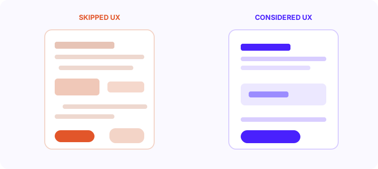
We've seen it dozens of times. A team skips the design phase to save time and money, goes straight to development, and ends up rebuilding half the app six months later because users can't figure it out. The money they saved on design gets spent three times over in rewrites.
The Cost Multiplier Nobody Talks About
IBM published research showing that fixing a usability problem in development costs 10x more than fixing it in design. Fixing it after launch costs 100x more. Those numbers are specific to software but the principle holds across every product category. The further a flaw travels through the build process, the more expensive it becomes to correct.
A 3-week UX phase that catches a fundamental navigation problem saves 6 to 10 weeks of redevelopment downstream. That's not a soft estimate - it's a calculation based on the cost of developer time spent rebuilding screens, re-testing integrations, and re-training users who learned the wrong flow first.
Real Examples of UX Failures in Real Products
A fintech client came to us after building their onboarding flow without a design phase. The development team built what the brief described but nobody had tested whether users could actually complete it. The result was an 8-step registration process with unclear field labels, no progress indicators, and a final screen that didn't confirm success. Drop-off during onboarding was 72%. Nearly three quarters of signups never completed registration.
Another client built a B2B dashboard that looked impressive in screenshots but was unusable in practice. The most common action - generating a report - required navigating three levels of menus to reach. Users called support instead of figuring it out themselves. Support volume was so high the company hired two additional support staff before realizing the problem was the product, not the users.
“Skipping design does not save money. It moves the cost downstream, where every fix is slower and far more expensive.”
The real cost of skipping UXThe Hidden Costs That Add Up
- Higher development costs from unclear requirements and constant revisions during build
- Lower conversion rates because the user flow wasn't tested before it went live
- Increased support tickets from users who can't complete basic tasks
- Higher churn because the product feels frustrating to use even if it technically works
- Longer time to market because mid-build pivots break completed screens
- Negative reviews that damage trust before you've had a chance to fix the problem
What a Proper Design Sprint Looks Like
A well-run UX phase for a medium-complexity product takes 2 to 4 weeks. It is not a week of making things pretty. It starts with user research - understanding who is using the product, what they're trying to accomplish, and where existing tools fail them. Even 5 to 8 user interviews produce enough insight to identify the most critical usability problems before a line of code is written.
From research, the team moves to information architecture - mapping out all the screens, their relationships, and the user flows between them. This is where structural problems get caught. If an action requires 6 steps when 2 would do, you find that in architecture, not in development.
Wireframes come next. Low-fidelity sketches of every screen, tested with real users. This is the cheapest possible form of feedback. Moving a button on a wireframe takes 30 seconds. Moving it on a coded screen takes 30 minutes and breaks three other things.
Deliverables From a Proper UX Phase
- User research summary with key insights and pain points documented
- Information architecture diagram showing all screens and navigation paths
- Low-fidelity wireframes for every key user flow
- Usability test report from testing wireframes with 5+ real users
- High-fidelity UI designs with interaction states (hover, active, error, empty)
- Design system with color tokens, typography scale, spacing rules, and component library
- Developer handoff in Figma with annotations and asset exports
Calculating the ROI of Good Design
The ROI calculation for UX investment is straightforward. If your product currently converts 2% of signups into active users and a UX overhaul moves that to 4%, you've doubled activation without spending a cent on acquisition. If you're spending 50,000 rupees a month on paid traffic, better UX makes that same 50,000 work twice as hard.
Support cost reduction is another direct line. Every user who can't figure out a feature independently submits a ticket. At scale, that's real salary cost. A well-designed onboarding flow that reduces support tickets by 30% pays for the design work in the first quarter.
What Happens When You Do It Right
The projects we're most proud of are the ones where we invested the full design phase upfront. One SaaS product we built for a logistics company went through a 3-week design sprint before any development started. Onboarding completion rate at launch was 84%. Support volume in the first 60 days was low enough that a single part-time person handled it.
That's not luck. That's what happens when you test your assumptions before you build them in. Every project we take on starts with design. Not because we're a design company, but because it's the single best way to reduce risk and ship something users actually want to use.