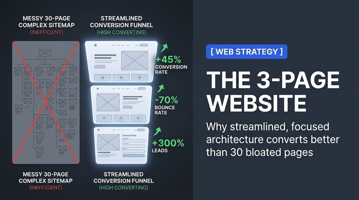
A client came to us after spending six months building a 30-page website that wasn't converting. Visitors were landing on the homepage and leaving. The site had everything - service pages, team bios, case studies, a blog, testimonials - but no focus. This is what we learned from fixing it.
Why More Pages Create More Problems
More pages means more decisions for visitors. Every navigation link is a fork in the road. The more forks you present, the more likely visitors are to choose none of them and leave. This is decision paralysis, and it's real - research by Sheena Iyengar on choice overload shows that reducing options consistently increases conversion, across categories from jam to investments.
The 30-page website had a navigation bar with 8 top-level items, each with dropdown submenus. A first-time visitor had no obvious starting point. They could read about the company's history, browse 12 service pages, view the team directory, or read the blog - all before understanding the core value proposition. The site was built for the company, not for the visitor.
“Every extra page is another place to lose someone. A focused site with three strong pages out-converts a sprawling one almost every time.”
Why less winsThe Homepage - What It Must Do in 5 Seconds
The homepage has one job: answer three questions before the visitor decides to leave. What is this? Who is it for? What should I do next? Everything above the fold must address these three questions. Company history, awards, and detailed service descriptions come later. The hero section comes first and it has to earn the scroll.
The value proposition headline should describe the outcome the customer gets, not what you do. 'We build web applications' is what you do. 'Launch your web app in 8 weeks, not 8 months' is the outcome. The difference in conversion rate between these two approaches is not small.
- Headline: outcome-focused, specific, addresses the primary customer pain point
- Subheadline: who you serve and the method - one sentence
- Single primary CTA: above the fold, repeated at the bottom of every section
- Social proof: real logos or real testimonials within the first scroll - not 'trusted by clients worldwide'
- Problem statement: describe the pain they're already feeling in their own language
- Solution overview: brief - how you solve it, not a feature list
The Trust Page - Building Credibility Without Fluff
The second page is where visitors who are interested but not yet convinced go to verify their decision. It answers: are these people credible? Have they done this before? What will it be like to work with them? This is the place for your team, your process, your case studies, and your testimonials.
Specificity is everything here. 'We've helped many businesses grow' is nothing. 'We've helped 40+ service businesses in India and the UK reduce their time-to-quote from 3 days to 4 hours' is credibility. Real numbers, real outcomes, real client names where you have permission to use them.
The process section deserves attention. Clients are buying an outcome but they're also buying an experience. Walk them through what working with you actually looks like: discovery call, proposal, kickoff, weekly updates, delivery. Making the invisible visible reduces perceived risk.
The Contact Page - Remove Every Friction Point
Most contact pages are a list of hurdles. A long form asking for company size, industry, budget range, project type, and a detailed brief before the client has even spoken to you. That's friction. The goal of the contact page is a single next step: get on a call.
Name, email, and a brief message. That's all you need. A booking widget (Calendly, Cal.com) that lets prospects book a 30-minute call directly removes even the email step. We tested both approaches for clients. Direct booking consistently produces higher conversion because it removes the waiting step - the gap between 'I'm ready to talk' and 'they've replied and we've scheduled a call.'
Copywriting Tips for Each Page
- Write every headline as if the reader will read only that - because many will
- Use 'you' more than 'we' - the reader is interested in their outcome, not your credentials
- Replace passive constructions ('solutions are provided') with active ones ('we build solutions')
- Put the most important claim first in every paragraph - don't bury the lead
- Use numbers whenever possible - '4 weeks' is more compelling than 'quickly'
- Test your headline with people outside your industry - if they don't understand it, rewrite it
When 3 Pages Isn't Enough
Three pages is a structure for clarity, not a limit. If you serve genuinely different audiences with different problems (enterprise vs. SMB, or three completely different service lines), add pages for each. The rule is that each page should serve a specific visitor type or a specific stage in the decision process.
The 30-page site we stripped down to 3 saw conversion rate go from 1.2% to 4.8%. Contact form submissions tripled in the first month. Time on site increased because visitors weren't lost in a maze of pages. They landed, understood, and acted. More pages don't mean more credibility. Clarity does.